The face behind our typeface: Patrick Savolainen discusses improvements to Hyphen’s custom font
Carefully chosen words and pictures can have an enormous impact as history has shown us – and it can be the same with fonts.
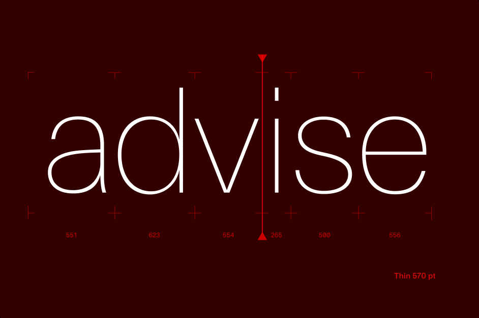
Our Head of Design, Patrick Savolainen, firmly believes in the power of typefaces in conveying deeper meanings – and he backed that up in 2021 by creating his own font, designed especially for Hyphen. Now, he has revisited to make significant improvements.
Typefaces are ‘visual manifestations of language’ and are constantly evolving, he says. He believes they are just like any other aspect of culture: deeply individual and capable of representing different values and tastes.
“Just as Hyphen looks for the perfect fit when engaging experts, we simply want the perfect fit when it comes to composing text,” Patrick adds.
Typography has huge symbolic, artistic and branding value in the modern world, with Netflix devoting an episode to the subject in its series, ‘Abstract: The Art of Design’. Furthermore, many of the world’s largest organisations have devoted hundreds of thousands of dollars to building fonts that illustrate their brands – though this can actually save them money in the long run.

The font upgrades are part of Patrick’s ongoing branding overhaul. Blending art and science, tailoring the typeface has been the most laborious of labours of love but serves a real purpose. After all, if the written text can be described as the voice of a brand, the font could be described as the sound of that voice.
“A typeface is maybe the most elementary level of visually communicating a brand,” he explains. “We have to use a typeface if we want to ‘say’ something, even if it’s just writing an invoice. This typeface represents the values and value proposition of Hyphen.”

Patrick says he took inspiration from Swiss design methodology and has created a ‘neo-modernist’ typeface. This creates a different feel to many of the world’s most common fonts, some of which date back hundreds of years. Characters are designed in a way that presents them in higher resolutions for print and on screens than popular neo-grotesque fonts from the second half of the 20th century.
Our font, which possesses wordmark qualities, is essentially the result of blending two schools of typeface thought – geometric and neo-grotesque. The former style uses geometric shapes to build characters, highlighting contrasts in sizing. Neo-grotesque typefaces, meanwhile, attempt to perfect proportions and minimise size differences between characters.

Patrick has used neo-grotesque architecture to ensure there is consistency in the sizing of characters but has made them more shapely through the use of geometric proportions.
When explaining why he built our typeface in the style he did, Patrick says: “What’s the difference between engaging a bunch of highly skilled, young, fresh top-tier consultants and the perfect senior expert? While the first group might master the art of gathering data, insight, validations, benchmarks etc. in a high-paced environment, the latter has this one thing they do not: wisdom forged from years of real-life experience.
“This dance between rationalism and personality comes together to form the concept or goal for the typeface.”

The result is something truly unique and is in-keeping with our reputation for developing custom solutions. Keep your eyes peeled for another feature about the emphasis we place on creativity and originality at Hyphen.